

The Hidden Power of Color Psychology: Why Your Brand Colors Are Make-or-Break
Picture this: You have two seconds to make a first impression. No words, no elaborate explanations, just pure visual impact. In those crucial moments, one element carries more weight than any other in shaping how people perceive your brand. That element? Color.
It might sound dramatic, but the science backs it up. Research shows that up to 90% of snap judgments made about products can be based on color alone. Even more striking, color can increase brand recognition by up to 80%. This isn't just marketing fluff; it's evolutionary psychology at work.
This blog includes:
Latest research and statistics:
- Up to 90% of snap judgments are based on color alone DisneystoreCNBC
- Color can increase brand recognition by up to 80% A first look at Starbucks leadership experience 2025
- 35% boost in brand recognition for consistent color strategies Disney’s Power Players Dominate the 2025 Upfront | The Walt Disney Company
Detailed color meanings with examples:
- Blue (Facebook, IBM, Chase) for trust and professionalism
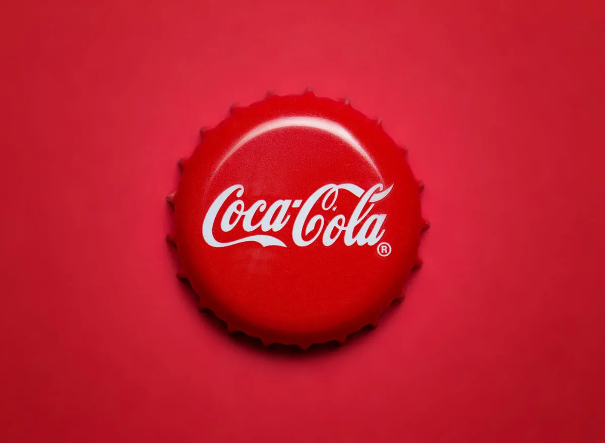
- Red (McDonald's, Coca-Cola, Target) for urgency and action
- Green (Starbucks, Spotify, WhatsApp) for growth and innovation
- Black (Chanel, Nike, Apple) for luxury and sophistication
- Purple (Yahoo, Twitch, FedEx) for creativity and innovation
Real case studies:
- Coca-Cola's (I've trained their execs on thinking bigger) New Coke disaster and color consistency AppleApple
- Starbucks' green evolution strategy
- McDonald's red and yellow psychology combination
The Science Behind the Magic
Our brains are wired to respond to color in ways that bypass conscious thought. Evolution probably nudged us this way: bright colors in nature can signal ripeness or, conversely, danger, prompting immediate emotional reactions. This ancient programming now influences every purchasing decision your customers make.
When someone encounters your brand, their brain processes color information faster than text, shapes, or any other visual element. This creates an emotional response before they've even had time to think logically about what you're offering. The question isn't whether color affects your brand perception; it's whether you're using this powerful tool strategically or leaving it to chance.
Decoding the Color Code: What Each Shade Really Says
Understanding color psychology isn't about memorizing a list of "red means passion" associations. It's about understanding the complex interplay between cultural context, personal experience, and biological response. Here's what current research reveals about key colors in branding:
Blue: The Trust Builder
Blue conveys trust, clarity, and professionalism, which is why it's heavily used by fintech, healthcare, and SaaS brands. Think Facebook, IBM, or Chase Bank. Blue activates the parts of our brain associated with calm and reliability, making it perfect for brands that need to establish credibility quickly.
However, not all blues are created equal. Navy blue suggests authority and tradition (think IBM), while lighter blues feel more approachable and modern (like Twitter's brand evolution). The specific shade you choose can mean the difference between appearing trustworthy and seeming cold or distant.
Red: The Action Trigger
Red is the color of urgency and passion, which explains why it's everywhere in fast food and retail. McDonald's, Coca-Cola, and Target all use red to create a sense of energy and encourage quick decision-making. Red literally increases heart rate and creates a sense of urgency, making it incredibly effective for driving immediate action.
But red requires careful handling. Too much can feel aggressive or overwhelming, while the wrong shade can appear cheap or garish. The key is balance and context.
Green: The Growth Signal
Green has evolved beyond its traditional associations with nature and money. Modern brands use green to signal growth, harmony, and forward-thinking innovation. Starbucks, Spotify, and WhatsApp all leverage different shades of green to communicate freshness and progress.
The challenge with green is avoiding the cliché. Environmental brands have overused certain shades of green to the point where they can feel generic. The most successful green brands choose unexpected shades that stand out while still communicating their core values.
Black: The Luxury Statement
Black conveys sophistication, exclusivity, and premium quality. Luxury brands like Chanel, Nike, and Apple use black strategically to position themselves as high-end and desirable. Black creates contrast and makes other colors pop, which is why it's often used in minimalist designs.
The risk with black is appearing too serious or intimidating. It works best when balanced with other elements that add warmth or accessibility.
Purple: The Innovation Indicator
Purple has become the color of creativity and innovation in the digital age. Yahoo, Twitch, and FedEx all use purple to suggest they're forward-thinking and unique. Purple combines the energy of red with the stability of blue, creating a sense of balanced innovation.
Purple can be tricky to execute well. It needs to feel intentional rather than arbitrary, and the specific shade matters enormously. Too light and it feels childish; too dark and it can appear mysterious or even ominous.
Real-World Success Stories and Spectacular Failures
The Coca-Cola Classic Case Study
One of the most famous color-related branding stories involves Coca-Cola's consistency with their signature red. While the company made a massive branding mistake in 1985 when they changed their formula for "New Coke," they never wavered on their color palette. That red has become so synonymous with the brand that it's practically trademarked in consumers' minds.
The lesson? Color consistency creates brand equity that can weather other storms. Coca-Cola's red is instantly recognizable across cultures and generations, creating a visual anchor that transcends language barriers.
Starbucks: The Green Evolution
Starbucks provides a masterclass in color evolution. Their green has shifted over the years from a more traditional forest green to a more vibrant, contemporary shade. This evolution reflects their transformation from a small coffee shop to a global lifestyle brand, all while maintaining the core association with growth and freshness.
McDonald's: The Psychology of Speed
McDonald's red and yellow combination isn't accidental. Red creates urgency and appetite stimulation, while yellow adds friendliness and optimism. Together, they create the perfect psychological environment for fast food: hungry, happy, and ready to make quick decisions.
The Costly Mistakes Most Businesses Make
Mistake #1: Following Trends Instead of Strategy
Too many businesses choose colors because they're "on trend" rather than because they align with their brand strategy. Color trends come and go, but your brand needs consistency to build recognition and trust.
Mistake #2: Ignoring Cultural Context
Colors mean different things in different cultures. White signifies purity in Western cultures but mourning in some Eastern cultures. Red is lucky in China but can signal danger elsewhere. If you're planning to expand globally, your color choices need to work across cultural boundaries.
Mistake #3: Overlooking Accessibility
Millions of people have color vision deficiencies, yet many brands ignore this when making color choices. Your brand needs to be recognizable and functional for everyone, not just people with perfect color vision.
Mistake #4: Inconsistent Application
Having great brand colors means nothing if you don't apply them consistently across all touchpoints. Brands that effectively align their color strategies across multiple platforms can experience a notable 35% boost in brand recognition.
Mistake #5: Choosing Based on Personal Preference
The biggest mistake? Choosing colors because you like them rather than because they serve your brand strategy. Your personal favorite color might be completely wrong for your business goals and target audience.
The Strategic Approach to Color Selection
Effective color psychology in branding isn't about picking pretty colors; it's about creating a systematic approach that aligns with your business objectives. The more you understand how colors work together, the better your chances of creating an impactful visual identity, though it can be tricky to get this right.
This is where the complexity becomes apparent. You're not just choosing a single color; you're creating a complete palette that works across digital and print media, various lighting conditions, and different cultural contexts. You need to consider how your colors will appear on everything from business cards to billboards, from smartphone screens to packaging.
The psychological impact of color also depends heavily on context. A red that works perfectly for a fitness brand might be completely wrong for a financial services company. The same blue that builds trust in healthcare might appear cold and impersonal in hospitality.
Why DIY Color Psychology Often Backfires
Here's the reality: Understanding color psychology requires research into the emotional associations of different colors, but it also requires understanding how those associations interact with your specific industry, target audience, and brand positioning.
Most business owners approach color selection like they're decorating their living room, choosing what feels good to them personally. But effective brand color psychology requires a deep understanding of consumer psychology, cultural implications, accessibility requirements, and technical considerations for reproduction across different media.
The brands that get this right don't leave it to chance or personal preference. They invest in understanding the science behind color perception and apply it strategically to achieve specific business outcomes.
The Investment That Pays for Itself
When you consider that up to 90% of snap judgments about products are based on color alone, getting your color strategy right isn't just about aesthetics; it's about business success. The right colors can increase conversion rates, improve brand recall, and create emotional connections that drive customer loyalty.
But here's what many business owners don't realize: fixing color choices after launch is exponentially more expensive than getting them right from the start. Once you've printed materials, built a website, and established market presence, changing colors means starting over with all your visual assets.
The most successful brands treat color psychology as a strategic investment, not a creative afterthought. They understand that the right color strategy can differentiate them in crowded markets, communicate their values without words, and create the emotional connections that turn casual browsers into loyal customers.
Your brand colors are working 24/7 to shape perceptions about your business. The question is: are they working for you or against you? The difference between strategic color psychology and random color selection can literally be the difference between a brand that thrives and one that struggles to gain traction.
Ready to unlock the hidden power of color psychology for your brand? Let's explore how the right color strategy can transform your business from invisible to irresistible.
Victoria Wynn
Color Psychologist, Branding Expert, User Experience
0 comments