

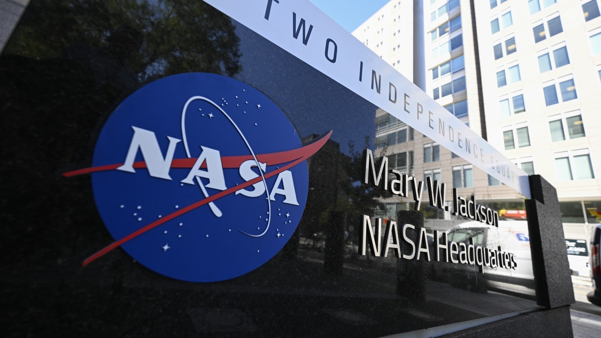
Why NASA Was My Most Demanding Client: A Masterclass in Brand Consistency
When NASA reached out to me for a logo design project, I thought I knew what I was getting into. After all, I'd worked with demanding clients before. But nothing could have prepared me for what became one of the most intellectually rigorous and psychologically fascinating branding projects of my career.
The brief seemed straightforward: create a logo for NASA's VAS department (Vibration, Acoustic, Shock). Simple enough, right? Then came the 42-page scientific PDF. Yes, you read that correctly. Forty-two pages of technical specifications, scientific principles, and engineering data that I needed to understand before putting pen to paper.

The Science Behind the Symbol
Most clients hand you a one-page brief and expect magic. NASA handed me a dissertation. That PDF contained everything from acoustic wave patterns to vibration frequency charts, shock absorption principles to material science fundamentals. The message was clear: if you're going to represent our department, you need to understand what we actually do.
This wasn't about creating something that looked cool or followed the latest design trends. This was about translating complex scientific concepts into visual language that would resonate with engineers, researchers, and stakeholders who live and breathe this technology every day.
I spent weeks studying that document, diving deep into concepts I'd never encountered. The learning curve was steep, but it revealed something profound about NASA's approach to branding: authenticity isn't negotiable. Every visual element had to be grounded in scientific reality.
The Iteration Marathon: 10 Options and Counting
The attached design sheet shows just how thorough this process became. Ten distinct logo concepts, each approaching the VAS department's identity from a different angle. Options 1-6 represented my initial interpretations of the scientific principles. Options 7-10 were my original conceptual explorations, pushing creative boundaries while maintaining scientific accuracy.
Each iteration told a different story. Some emphasized the wave patterns inherent in acoustic research. Others focused on the structural elements that define shock absorption. A few explored the mathematical precision that underlies vibration analysis. Every option was a deliberate attempt to capture not just what the department does, but how it thinks.
But here's where the real psychology of branding came into play: despite being a specialized department with unique needs, NASA insisted that whatever we created had to align with their iconic brand identity. This wasn't about creating something completely separate; it was about extending the NASA brand story into a new chapter.
The Psychology of Brand Architecture
NASA's brand guidelines are designed to ensure that the NASA brand is used consistently and appropriately across all platforms and partnerships, and this project was no exception. What I was witnessing was masterful brand architecture in action.
Brand architecture is the strategic framework that defines the relationship between a parent brand and its sub-brands, products, or services. NASA understood this intuitively. They knew that allowing departments to go completely off-brand would dilute the equity they'd built over decades of space exploration achievements.
Think about it psychologically: when people see anything associated with NASA, they bring decades of associations with it. The Apollo missions, Mars rovers, Hubble telescope images, cutting-edge innovation, and American ingenuity. These aren't just logos; they're symbols of human achievement. Why would any department want to abandon that psychological capital?
The Consistency Imperative
Effective brand consistency goes beyond using the same logo and colors. It's about creating a complete brand identity that resonates across every channel and every interaction. NASA's insistence on alignment with their master brand wasn't bureaucratic stubbornness; it was strategic brilliance.
Here's what most businesses miss: sub-brands that maintain connection to the parent brand benefit from what psychologists call "halo effect transfer." The positive associations consumers have with the main brand automatically extend to the sub-brand. For NASA's VAS department, this meant instant credibility, authority, and trust just by maintaining visual and conceptual alignment with the iconic NASA identity.
Brand architecture increases flexibility for product or service expansion in the future and helps reach target markets for each product or service. NASA was thinking beyond just this one department. They were creating a system that could scale across their entire organization while maintaining coherent brand equity.
The Design Evolution Process
Working through those ten iterations taught me something crucial about high-stakes branding: the best solutions emerge from constraint, not freedom. NASA's demanding requirements didn't limit creativity; they focused it.
Each design had to satisfy multiple stakeholders: the VAS engineers who needed to see their work accurately represented, the NASA brand team who needed consistency with established guidelines, and the broader scientific community who would interact with this identity. The constraints forced innovation.
The original mock-up ideas (options 7-10) show this constraint-driven creativity in action. These weren't just aesthetic exercises; they were attempts to solve complex communication challenges. How do you make vibration visible? How do you represent acoustic principles in static imagery? How do you capture the precision of shock analysis in a memorable mark?
What This Teaches Us About Brand Psychology
NASA's approach reveals sophisticated understanding of brand psychology principles that most businesses overlook:
Cognitive Load Management: By maintaining consistency with their master brand, NASA reduces the mental effort required for people to understand and remember their various departments. Our brains are pattern-recognition machines. When we see familiar visual cues, we can focus on new information instead of trying to decode entirely new brand languages.
Authority Transfer: The NASA brand carries enormous authority in scientific and technical circles. Sub-brands frequently utilize the reputation and established credibility of the parent brand. By maintaining alignment, the VAS department instantly inherits that authority rather than having to build it from scratch.
Ecosystem Thinking: Brand architecture helps ensure that all marketing strategies align with one another and will not clash in the future. NASA was thinking systemically, not just about this one logo but about how it would interact with their entire brand ecosystem.
The Hidden Costs of Brand Inconsistency
Most businesses underestimate what happens when departments or divisions go off-brand. You lose the psychological momentum that comes from consistent reinforcement of brand values. You confuse your audience about what you stand for. You waste resources building separate brand equity instead of amplifying existing assets.
NASA understood that their brand is more than a logo; it's a promise of excellence, innovation, and scientific rigor. Every visual touchpoint either reinforces that promise or undermines it. There's no neutral ground.
Why This Level of Rigor Matters
The 42-page technical document wasn't NASA being difficult; it was NASA being authentic. They understood that surface-level branding fails in technical industries where audiences can spot inauthenticity immediately. Engineers and scientists don't just buy products; they evaluate the competence and credibility behind them.
This project taught me that the most demanding clients often produce the most meaningful work. When organizations care deeply about accuracy, consistency, and authenticity, they push designers to create solutions that don't just look good but actually work in the real world.

The Strategic Investment in Brand Psychology
Looking back, NASA's approach represents a masterclass in strategic brand thinking. They invested time and resources upfront to ensure their sub-brand would succeed in the marketplace. They understood that brand psychology isn't just about aesthetics; it's about building cognitive shortcuts that make it easier for people to understand, remember, and trust your organization.
Consistent experience at all brand touchpoints best limits confusion and strengthens brand recognition. NASA wasn't willing to compromise on this principle, even for a specialized technical department.
The ten iterations we went through weren't excessive; they were necessary. Each option represented a different approach to balancing scientific accuracy with brand consistency. The final choice wasn't just about which design looked best; it was about which design would best serve NASA's long-term strategic goals.
This level of strategic thinking about brand psychology is what separates organizations that build lasting brand equity from those that struggle with recognition and credibility. NASA understood that every visual decision is a psychological decision, and they were willing to invest in getting it right.
The question for your business isn't whether you can afford to think this strategically about your brand psychology. It's whether you can afford not to. In competitive markets, the organizations that understand and leverage brand psychology principles will always have an advantage over those that treat branding as an afterthought.
Ready to apply this level of strategic thinking to your own brand challenges? Let's explore how psychological principles can transform your brand from forgettable to unforgettable.
Victoria Wynn
email: victoria@WynnModernArt.com
0 comments